
 Anirban Roy
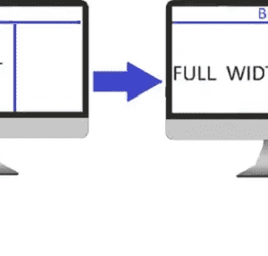
There are a lot of custom templates available for Blogger that provide a wide range of customization, but what most of them lack is an edge to edge full-screen view.

As illustrated in the above image, most of the custom templates available for Blogger do not come inbuilt with the feature to cover the full-screen width in the homepage, posts and pages.
Thus, many bloggers find it difficult to make their Blogger/Blogspot blog full width in order to make it cover the entire screen and provide an attractive edge to edge viewing experience.
The way how different elements look on a website, is governed by CSS (Cascading Style Sheets) rules.
In most CMS which allow FTP access, the CSS files are independent from the HTML files and are imported as stylesheets into the HTML, to be served to the browser.
In Blogger however, we do not get the FTP access and mostly all the CSS rules are included in the page’s <head> section itself. (I’m saying “mostly” because sometimes the developer may serve the CSS from an external source and import them in the HTML, but there’s no need to worry about that as we can always override the existing CSS using !important.)
In this article, I will show you a simple process by which you can make any Blogger template full width (edge to edge display) on any display, no matter how large the screen is, by simply editing or overriding the CSS.
Table of Contents
- 1 Blogger Template Full Width Transformation Service
- 2 Quick Fix Methods
- 3 STEPS TO MAKE BLOGGER BLOG FULL WIDTH
- 4 Issue Still Not Fixed?
Blogger Template Full Width Transformation Service
Not feeling like digging into the code and making the changes yourself?
You can directly use our brand new Blogger Full Width Template Transformation Service, where we’ll convert your template to make it full-width, with guaranteed results.

Quick Fix Methods
The quick fix methods don’t work on all the templates. If it doesn’t work for you, skip to the next section where the full tutorial for making blogger template full width is given.
Method 1: Overriding The Existing CSS
Go to Blogger –> Theme –> Edit HTML and search for </head> using CTRL+F.
Paste the following code just above the </head> tag:
<style>
#outer-wrapper, .container, #content-wrapper{
width:100%!important;
margin:0!imporant;
padding:0!important;}
</style>
Method 2: Changing The Row Value
Go to Blogger –> Theme –> Edit HTML and copy the full code using CTRL+C.
Open Notepad and paste the code.
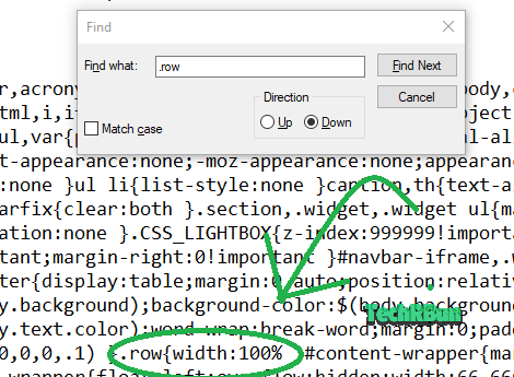
Press CTRL+F and search for “.row” (without quotes)
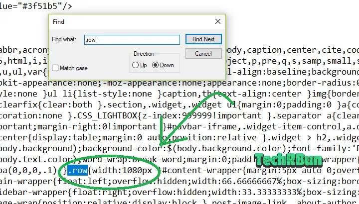
You will then find the line where the width of the row is defined. Replace the width value of the row with 100%, i.e. .row{width:100%}
Now copy the whole code from Notepad with CTRL+A and CTRL+C.
Go to the Blogger HTML editor and press CTRL+A to select the whole code and press DEL to delete it.
Now press CTRL+V to paste the new code. Now hit the SAVE button.
Your Blogger blog has now become full width! Congrats!
But what if this method doesn’t work for you? Well then your template doesn’t support the row variable, and in that case, please follow the full guide given below. 👇 👇
STEPS TO MAKE BLOGGER BLOG FULL WIDTH
0. Take A Backup Of The Source Code (Very Important)
Go to Blogger –> Theme –> Edit HTML.
Select the whole source code using CTRL + A, copy it using CTRL + C, paste it in Notepad and save it on the desktop.
This step is very important because if you accidentally follow the steps incorrectly, this backup file will help you to restore your blog to the previous form.
1. Head Over To Your Website/Blog
Open Google Chrome or any other browser that supports the Developers Tools function. Then go to your website/blog.
2. Inspect Size Of The Elements

Once your website is fully loaded, press the F12 key from your keyboard and the ‘inspect elements‘ box will appear at the right-hand side of the screen as shown in the image.
Click on the button shown in the image above and hover your mouse over the content of your blog which you want to make full width, as shown below.
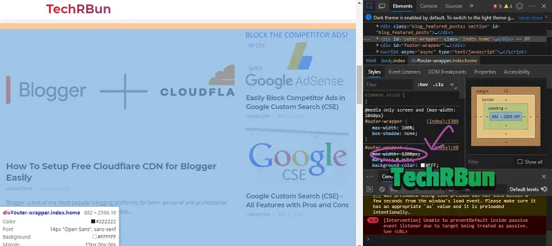
Now you will be able to see max-width of your blog. Our aim is to change it to auto mode so that it fits edge to edge (full width) on any screen on which it is viewed.
Either remember or note down the current max-width value somewhere.
3. Make Changes To The Widths in The Source Code
Go to Blogger.com and click on Theme from the left bar and then click on Edit HTML, as shown below.

[IMPORTANT] PLEASE MAKE SURE THAT YOU TAKE A BACKUP OF THE SOURCE CODE AS SHOWN ABOVE, BEFORE PROCEEDING TO TWEAK IT.
Once the Edit HTML page has loaded, press CTRL + F to bring up the search box.
Search For The Width Variable In The Source Code
Search for the #outer-wrapper max-width value (in my case it is 1200) that you just inspected. Press Enter to see the search results.
Please note that in your template the variable name (max-width) might be different, but it will be somewhat similar, meaningful and recognizable.

Now you’ll have to make two changes, as you can see in the #outer-wrapper, there are two widths defined: max-width and width. Change both the values to auto as shown below. This will make your main blog content stretch up to the edge.
Inspect The Main Wrapper Width
Now again go to your site and refresh the page.
Next, inspect the width of the Content (#main-wrapper).

Remember the width (location shown by the arrow in the image) of the wrapper.
Edit The Main Wrapper Width
Go back to Blogger –> Edit HTML.
Now, search for the width value that you just inspected (in my case it is 800).

Replace the width value with 70%, and after the semicolon, add- padding-right:30px;
It would then look like : width:70%;padding-right:30px
Do not make any other changes in that line.
Inspect The Width Of The Sidebar
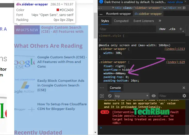
In my case, as it can be seen from the screenshot, the width is 300px.
Remember the value.
Edit Sidebar Width In Source Code
Again, go to Blogger –> Edit HTML.
Search for the sidebar width (300px in my case) which you inspected just now, from the source code in Edit HTML.

Replace the width value with 27% and remove float: right (if present)
It would then look like width:27%;
Do not make any other changes on that line.
Finally, click on Save changes.
Refresh your blog and verify that if it has become full width or not.
Also Checkout – My handpicked list of the best magazine templates for blogger.
Hope this tutorial has helped you and you could make your blog full width successfully.
If not, please recheck that you followed all the above steps properly.
Open the backup text file from the desktop that you made in Step 0, select all the code, copy it and paste it in the HTML editor and click on Save changes.
Your blog will be restored to the previous format. Now, please follow all the steps again, more carefully.
Done! Congratulations!
You’ve successfully made your blogger blog full width and now your blog will be displayed edge to edge (100% full width) on any screen, no matter how large or small it is.
Issue Still Not Fixed?
I understand it’s a bit confusing task to do, especially finding out the correct line of code where the change has to be made.
So, if you fail to fix it yourself even after many attempts, feel free to leave a comment down below with the URL of your site. I will reply to your comment with the specific CSS that’s needed to make your site full width. 🙂
With so many requests nowadays, it’s difficult for me to respond to all of them. So, along with my team, I’ve launched a brand new Blogger Full Width Template Transformation Service which you can use to get your blog’s template converted into full width. We guarantee the success of our service and I am sure that you’ll be impressed by the work of our team.
Also check out: How to make Progressive Web App (PWA) for Blogger
If this article has helped you, don’t forget to share it on your favourite social media site, because you know, Sharing is Caring! : )
Tired of slow indexing of your blog posts by Google? Check Out: How To Get Your Blog Posts Indexed By Google Instantly [2 Minutes]
You might also like: How to Correctly Setup Cloudflare Free CDN for Blogger + Features Review


Worked for me. Great!
I’m glad that my article has helped you in making your blogger blog full width.
I want to make my blog full size but not able to do so even after trying the tricks you suggested . Could you please help me
Hi Rishita,
I’ve replied to your e-mail with the modified source code to make your blogger template full width 🙂
not worked for me bro please can i add you admin to set it for me. i will give you backlinks on my 2 posts
My blog shows good on desktop but on mobile devices its width is so small (thin) please help me email bongoexclusive[at]hotmail[dot]com
Sure bro, I can do that for you and make your blog full width so that it looks good on every screen. You can contact me at [email protected]
bro i also facing same problem , i will send you source code . can you make that full width of my website
sure!
Thank you so much dude! I was looking for this tutorial since a long time and finally I found this one and this actually works! Now my blog fits full width on big screens and small screens as well and it looks amazing!
I’m glad that this article has helped you to make your blog full screen!
Please i try locating outer-wrapper max-width on my blog edit html and is not showing please i will need your help and also, how to drive more traffic to my blog thank you. [URL REMOVED]
Hi! I will surely try my best to help you out. I will e-mail you. You will have to invite me to your blog and I can fix that for you. ☺️
Either reach out to me on Instagram @heyanirban or send me an email at [email protected] and I will help you out regarding your blog’s width.
To get more traffic, promote your articles on quora. Answer related questions and leave a link to you website at the end. This method works great. Also, if you use a keyword research tool, simply write articles on keywords that have low competition. I would recommend not to depend entirely on keyword research tools as they are pretty inaccurate. Simply Google for stuff related to your niche. If you feel like the articles that are ranking are missing some info or are irrelevant, waste no time and write an article and submit it to google search console. Your article will surely rank high and bring in a lot of traffic if it’s of good quality. If you’re targeting a global audience, I would recommend you to use .com domain instead of .com.ng.
I have also noticed that you are writing posts on a lot of topics and that too saturated and are on very competitive niches.
I would strongly recommend you to check out the 8 Dangerous Blogging Mistakes That Beginners Must Avoid [Motivation] article on this site. So that you don’t waste your time doing stuffs that are not worth it.
You may also check out Google questions hub. It suggests you topics to write articles on that people are looking for but not getting a satisfactory result.
I will soon publish and in-depth article on how to grow blog traffic. I will notify you when I publish it. ?
Thank you, Anirban
For the blog readers: I contacted Anirban via E-mail and gave him my HTML code. He edited it and made my blog full width. Now it looks great!
Hi. Bro its not working for me . Plz help me https://techmilltamil.blogspot.com/ this is my blog
Hi Paul, I will have to check the source code of your blog in order to help you out. Please e-mail your HTML code to me at [email protected]
Thank You, Anirban for helped me to fixed that blog posts problem. Thank You So much
Before:
After:
You’re welcome!
Anirban edited my template and made my blog full width. Thank you!
Before
After
Bro,i want to increase my blogger gadget width please help me out of this.
Hi Tushar,
Please comment down your URL and point out the exact gadget you’re talking about.
examorbit[dot]blogspot[dot]com/?m=1
I want all the gadgets size into full width so bro please help me
Bro please help i sent you a details
Bro please give me solution
Hi Tushar, I checked your site.
Add the following code just below the head tag in your Blog’s HTML code. That should solve the issue.
Please replace the (less than sign) with < and (greater than sign) with >
(less than sign)style(greater than sign)
.sidebar .widget-content{padding:0!important;}(less than sign)/style(greater than sign)
But where’s is the code please send me the code
Please replace the (less than sign) with < and (greater than sign) with >
(less than sign)style(greater than sign)
.sidebar .widget-content{padding:0!important;}(less than sign)/style(greater than sign)
But where’s to insert this
Bro it doesn’t work i want to increase whole gadget width
you need to insert it just below the head tag. What do you exactly mean by “increase whole gadget width”? I noticed there was some padding around your gadgets so I gave you the code to remove those paddings.
Do you want to increase the width of your whole sidebar?
Yes bro i want to increase width of whole sidebar
In that case, put the following code below your head tag.
Replace the (greater than sign) with > and (less than sign) with <
(less than sign)style(greater than sign)
#sidebar-wrapper{width:50%!important;}(less than sign)/style(greater than sign)
My probldm is not solve but thank you Anirban for help
Tushar, can you please take a screenshot of your blog, edit the image using paint, make the sidebar look exactly the way you want and send it here?
To send an image, you can simply upload it to imgur and leave the link in the comment.
Bro can i get your blog theme .
It’s Newspaper Theme by tagDiv. Only available for WordPress.
Page should look like this no gap on left and right side
Bro i sent you a details
Okay, so you want both the paddings from the .sidebar .widget-content and the #content-wrapper to be removed…
So, adding this code to your head should work:
I rendered your blog after adding this code to your site, using the Chrome Dev Tool, and the output was:
So, I guess it should get the job done, just like the way you want it!
Thank you very much Anirban you help me a alot i wish you blog will grow more and more keep doing your work bro.
bro,
plz guide me
(1) how to ad menu bar (menu with sub menu) on my blogger theme.
i tried a lot but failed. my blogger address is –
https://tradehut.blogspot.com/
luckily i find you site on google & with the hope of solution m writing to you.
(2) how to ad slider with prev & next buttons on any blog.
plz guide me.
Thanks.
Hi Davinder,
I checked your site. You already have a menu. I see that you’re using the “ChattelsBlog” template. You can simply go to the Layout option in blogger and from their, you will find the option to edit the menu as per your choice.
I saw that you already have the “next/prev post” navigation buttons under your posts.
Is there anything else you need help with?
Thanks Sir for your reply but m unable to add drop down menu.
I checked layout option but no luck.
I also checked HTML code n tried but failed.
I have one more blog. I sent you my another blog address via email,
Please check and revert back.
Please help me n guide me.
You helped so many people n Now it’s my turn.
Please guide me thanks.
Looks like the theme you’re using doesn’t support drop down menus. So if you want to continue using this theme, you will have to code it on your own. I would recommend you to use some other theme that comes with drop down menus built in.
And about the Slider, there are plenty of JS based image sliders for Blogger available online, just Google search, and you will find plenty of them.
Please e-mail me only if you’re facing trouble making your template full width. This post covers only that topic.
Awesome, I couldn’t exactly understand everything because I am not that good at editing things, so I contatted him privatly and he explained me what to do.
Thank you so much!
Hi Anirban!
I read your article and all comments, I understand how your content information is valuable for us.
But sorry to say, It doesn’t help me, I have tried all things when I searched for those words which you explained above I didn’t find.
I’m using the ‘Blazing’ blogger template check my website mobile view, which I want to change. My site link: studelp.com
I hope you will reply and help me very soon.
Hi Saurabh,
Putting the following code inside your head tag should make your blog full-width:
If you face any more difficulty, feel free to e-mail me on [email protected]
Hello Anirban sir!
I read your article and all comments, I understand how your content information is valuable for us.
But sorry to say, It doesn’t help me, I have tried lots of things
I’m using the ‘Magify’ blogger template check my website mobile view, which I want to change.
My site link: https://www.krishimaster.com
I am sure you will help me very soon.
Hi Yashraj!
The following code should make your blog full width on mobile:
Copy the code directly from here:
PASTE THE CODE INSIDE YOUR HEAD TAGS.
As per your requirement, this code will only work on mobile devices, not on desktops.
Thank you very much, Anirban sir
Anirban sir ask me to my blog html code then I contacted Anirban via E-mail and gave him my HTML code.
He edited it and made my blog full width. Now it looks great adjectly what I want !
I am thankful for giving your precious time & done efforts for me sir
God bless you sir😊
I gave my site html and in a short time it was made exactly as I requested, thanks
Am I the only one struggling to find “.row” in my HTML.
Anirban Sir, Your article was helpful but at some point, things weren’t working out so well, I am not able to figure out where I went wrong. It would be my pleasure if you could help me out, do you take any coding lessons?
Hi Naira, You may leave your website’s URL here and I’ll help you out!
About coding, I plan to put up videos on my YouTube channel related to WordPress, Blogger and Web Development in general, but I’m not sure when I will be able to upload videos consistently!
Hi Anirban. The technique didn’t work for me. My blog is
codingwithart.com
I tried all the steps given but it’s exactly the same as before.
<style>#outer-wrapper{
max-width:100%!important;
margin:0!important;}
</style>
Put the above code in your HTML’s head section. That should do the job.
It worked. Thank you very much.
Great.
Thank you so much Anirban bro. You’re such a talented guy with a lot of patience to help beginners in blogging with your ultimate skill sets.
hi, sir i am unable to find the right code to change, can you change my html code for full width please?
You may share your blog’s url here and I will check it out.
hello please i want to change my Sora template skin and add a featured post to it also expand the mobile site as well
please i want to change my sora skin and add a featured post to it and also expand the mobile site as well
Hey I tried all the methods but none of them worked can you please tell me how can I make my blog full screen
this is the link to my blog-http://onespotanimeat.blogspot.com/
and here is the link to the theme which I used- https://animo-soratemplates.blogspot.com/
as you will notice the official theme is full screen but my theme comes like a page
Adding the following code to your head section will fix it.
<style>

    #outer-wrapper{max-width:100%!important;}

    </style>
where should I add this code
above the </head> tag.
https://my-lyrics-ly.blogspot.com/
Well your trick worked it gave full width . No issues in Mobile
But thumbnail size in
Pc or Laptop screen changes
i mean thumbnail get strected
You can exclude the thumbnails by defining a max-width for their selector.
Bro, I’m facing problem, I followed your step by step but it didn’t work. can you please help me?
Sure, let me know your site’s URL.
This article is very helpful for me. Thanks!